 Case Study
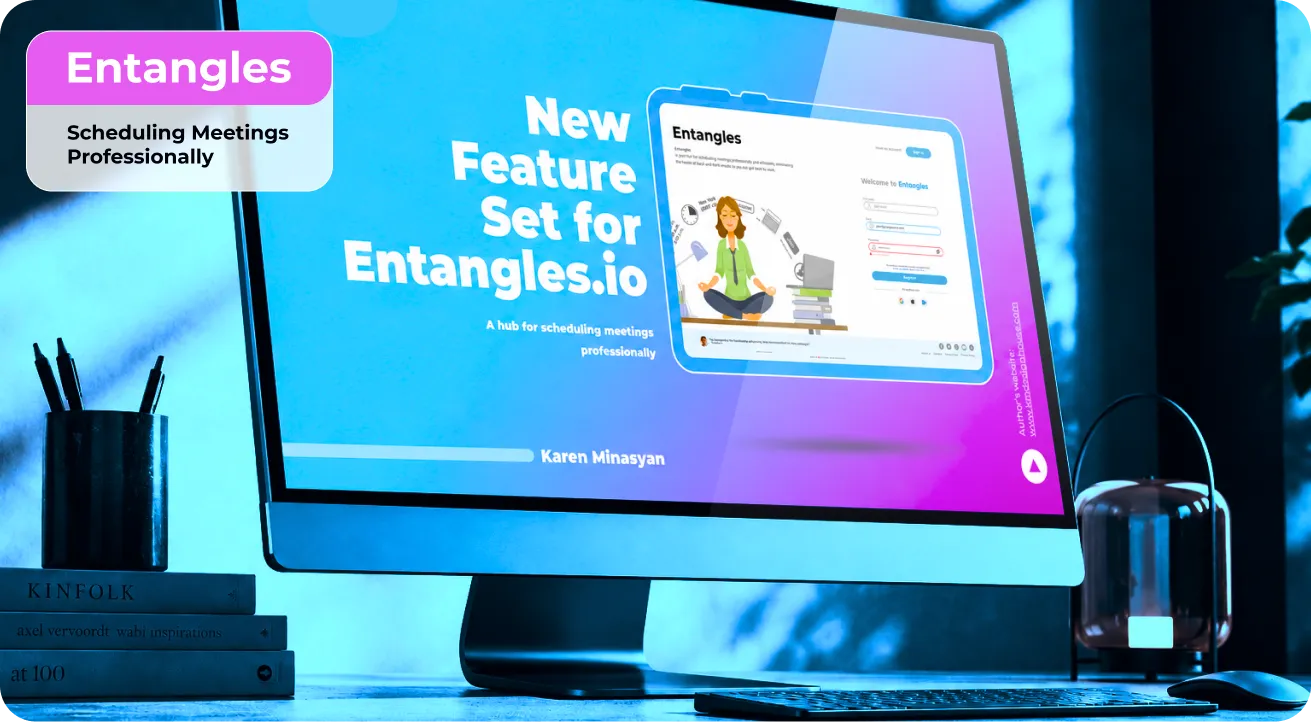
Entangles: Automated meetings scheduler
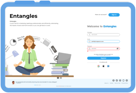
Entangles.io is a web app that simplifies meeting and task management by eliminating the back-and-forth communication typically required to find a suitable meeting time. Its key differentiator is an automated scheduling feature that identifies time slots when all participants are available.
The platform also enables users to view colleagues’ calendars, schedule and reschedule meetings, send invitations, set meeting locations, and manage tasks - all from a single interface.
Entangles: Automated meetings scheduler
Entangles.io is a web app that simplifies meeting and task management by eliminating the back-and-forth communication typically required to find a suitable meeting time. Its key differentiator is an automated scheduling feature that identifies time slots when all participants are available.
The platform also enables users to view colleagues’ calendars, schedule and reschedule meetings, send invitations, set meeting locations, and manage tasks - all from a single interface.
Starting Point
When I joined the project, it was already in the development stage. The client asked me to design a set of new features that they envisioned as a key differentiator from their competitors. The client already had a detailed description of these features, which provided the initial foundation and starting point for my work on the project.
Initial Survey
KANO Method
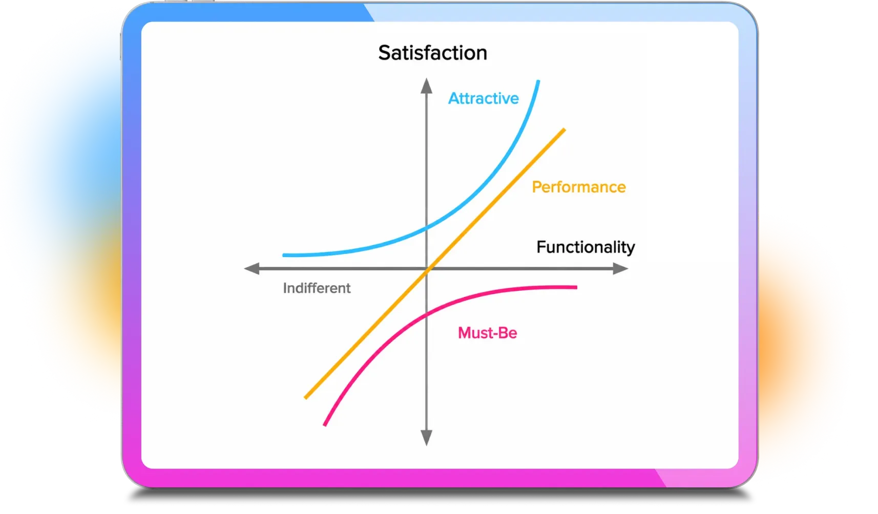
Starting with the list of proposed features, we prioritized them based on two key factors: their potential impact on the user experience and their ease of implementation.
As a result, we selected three of the seven features to focus on first. I suggested that, before moving into design and development, we validate these ideas from the users’ perspective. I recommended running a Kano analysis to understand how users would perceive each feature, and the team agreed.
Based on our analysis of the existing user base, we identified IT Managers, Product Managers, and Developers as our primary target users - professionals who regularly schedule and participate in meetings.
I then created a survey incorporating the Kano questions, and within one week, we collected 24 responses.
KANO Method
Starting with the list of proposed features, we prioritized them based on two key factors: their potential impact on the user experience and their ease of implementation.
As a result, we selected three of the seven features to focus on first. I suggested that, before moving into design and development, we validate these ideas from the users’ perspective. I recommended running a Kano analysis to understand how users would perceive each feature, and the team agreed.
Based on our analysis of the existing user base, we identified IT Managers, Product Managers, and Developers as our primary target users - professionals who regularly schedule and participate in meetings.
I then created a survey incorporating the Kano questions, and within one week, we collected 24 responses.
Survey Results
KANO Test Results
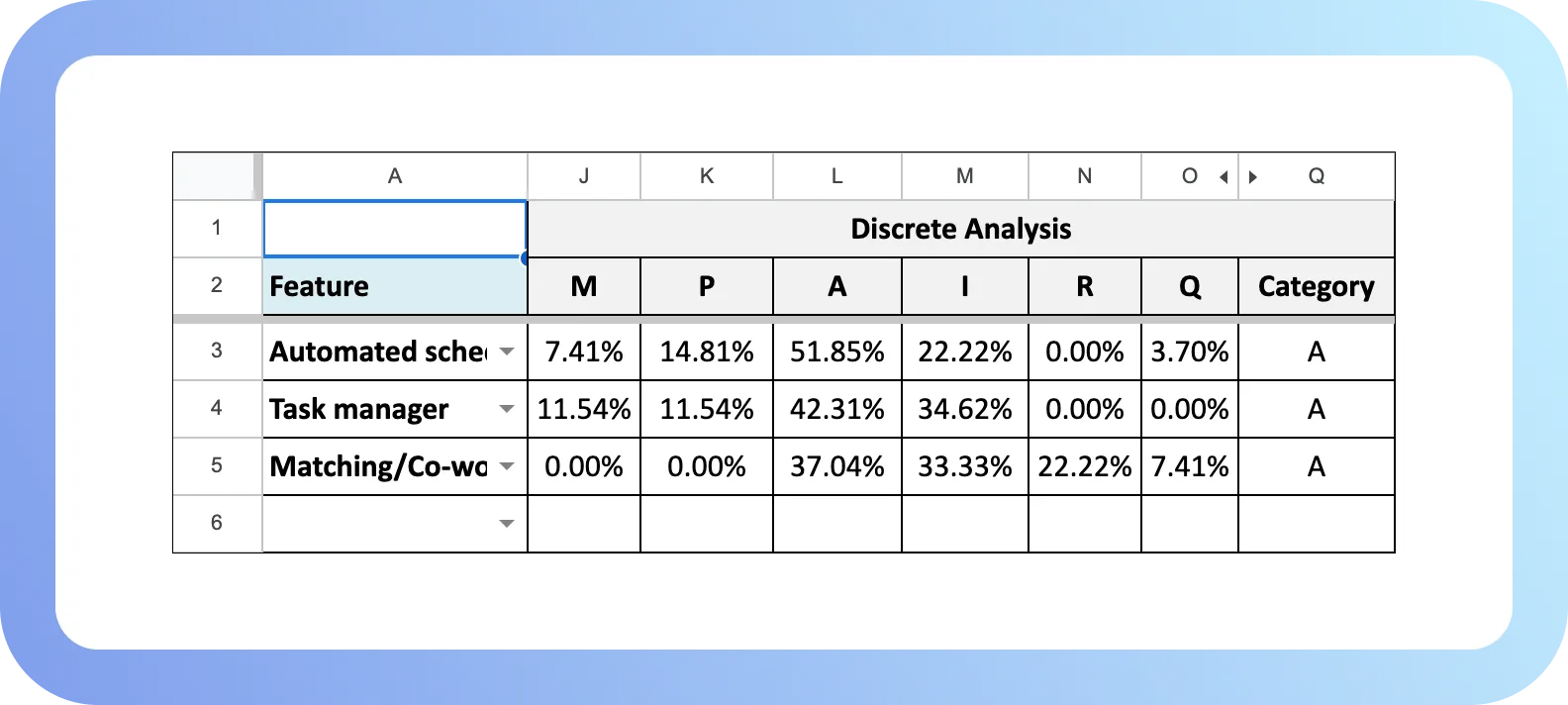
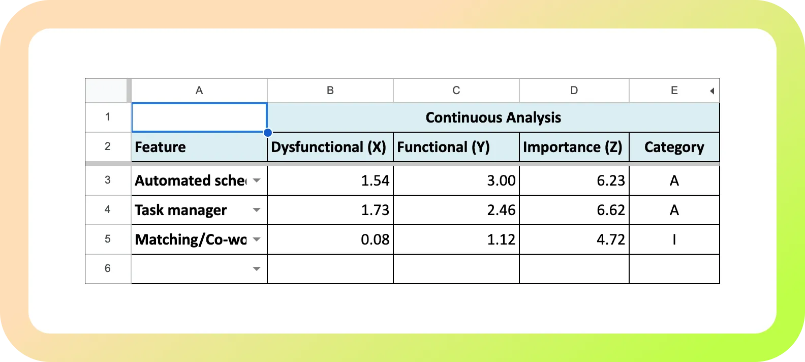
The results of the survey were as follows:
Automated schedule adjuster:
Attractive, Importance: 6.20
Task Manager
Attractive, Importance: 6.70
Matching/Co-working:
Indifferent, Importance: 4.70
KANO Test Results
The results of the survey were as follows:
Automated schedule adjuster:
Attractive, Importance: 6.20
Task Manager
Attractive, Importance: 6.70
Matching/Co-working:
Indifferent, Importance: 4.70
Research - Round 2
Another round of research
Based on initial findings, we hypothesized that additional customer segments might benefit from our product. To investigate, I conducted a second round of research using competitor review analysis, traffic insights via Similarweb, and social media groups monitoring.
This research validated our core audience - IT/Product Managers and Developers - while revealing secondary segments, including non-IT managers and educators. Ultimately, we chose to double down on our primary segment, for which I developed the following persona:
Another round of research
Based on initial findings, we hypothesized that additional customer segments might benefit from our product. To investigate, I conducted a second round of research using competitor review analysis, traffic insights via Similarweb, and social media groups monitoring.
This research validated our core audience- IT/Product Managers and Developers - while revealing secondary segments, including non-IT managers and educators. Ultimately, we chose to double down on our primary segment, for which I developed the following persona:
Persona
Sarah Collins

Age: 34
Job Title: Product Manager
Industry: Technology (SaaS)
Experience: 8 years in product development, 4 years as a Product Manager
Daily Responsibilities:
Sarah Collins
Age: 34
Job Title: Product Manager
Industry: Technology (SaaS)
Experience: 8 years in product development, 4 years as a Product Manager
Daily Responsibilities:
Goals:
Pain Points:
Goals:
Pain Points:
Accessibility
Accessibility Opportunity
After analyzing the research findings, I ideated and designed the first feature on our roadmap: Automated Schedule Adjuster. You can explore the prototype here:
Link to Prototype 1
Identifying an Accessibility Opportunity
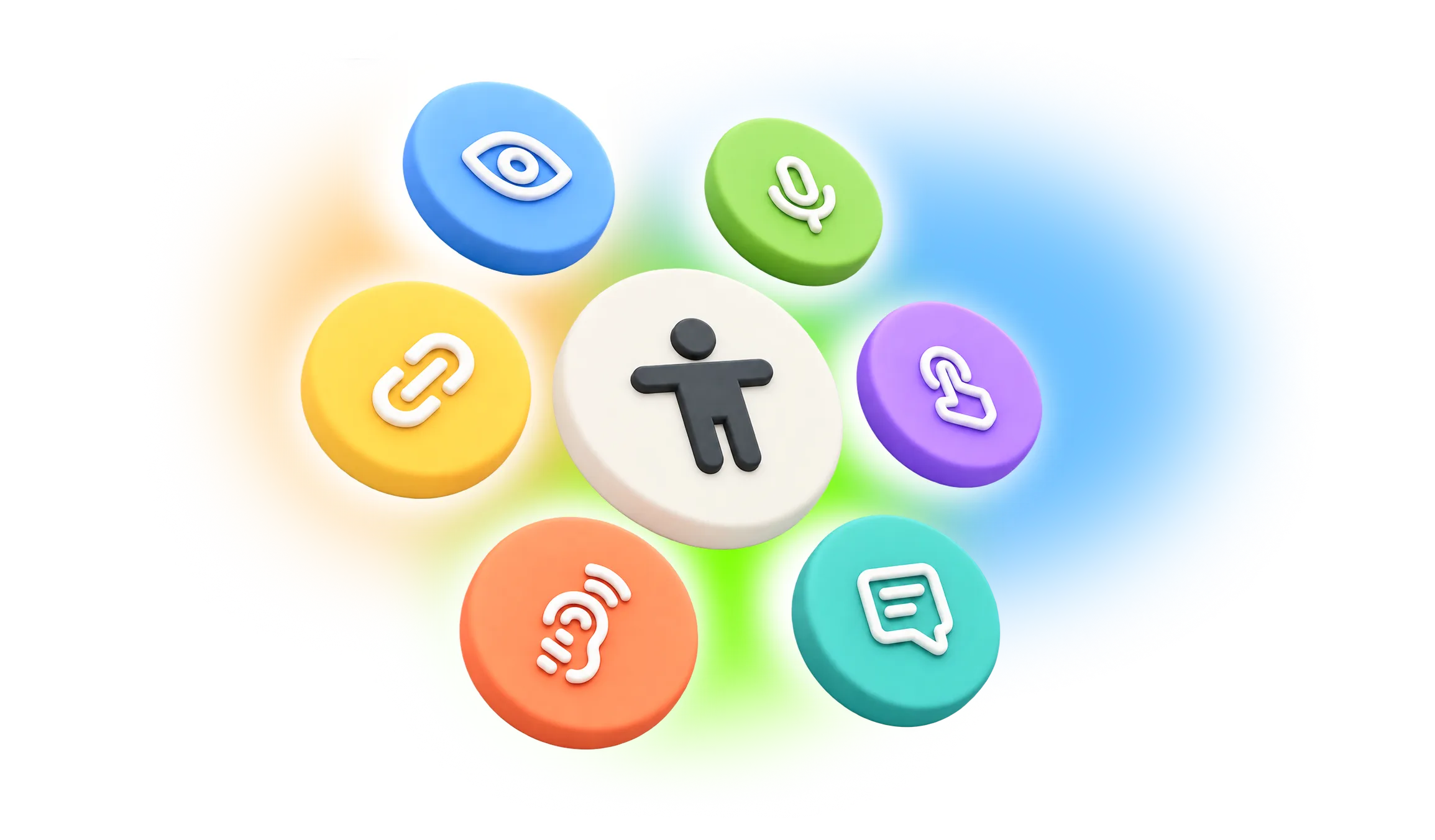
While designing this feature, I noticed several accessibility issues across other user flows that had been designed before I joined the project. I proposed conducting an accessibility review to identify and address these issues across the product.
As a result, I reduced the number of identified accessibility issues by 40%.
Some of the improvements included:
- Improved colour contrast for text and interactive UI elements across the product.
- Improved link accessibility by differentiating linked text from regular text using more than colour alone.
- Adjusted heading sizes and hierarchy on several pages to improve readability and accessibility.
- Made additional accessibility improvements across the product based on the findings of the review.
Designing the Task Manager After completing the accessibility improvements, I moved on to prototyping the second feature: Task Manager. You can explore the prototype here:
Link to Prototype 2
Accessibility Opportunity
After analyzing the research findings, I ideated and designed the first feature on our roadmap: Automated Schedule Adjuster. You can explore the prototype here:
Link to Prototype 1
Identifying an Accessibility Opportunity
While designing this feature, I noticed several accessibility issues across other user flows that had been designed before I joined the project. I proposed conducting an accessibility review to identify and address these issues across the product.
As a result, I reduced the number of identified accessibility issues by 40%.
Some of the improvements included:
- Improved colour contrast for text and interactive UI elements across the product.
- Improved link accessibility by differentiating linked text from regular text using more than colour alone.
- Adjusted heading sizes and hierarchy on several pages to improve readability and accessibility.
- Made additional accessibility improvements across the product based on the findings of the review.
Designing the Task Manager After completing the accessibility improvements, I moved on to prototyping the second feature: Task Manager. You can explore the prototype here:
Link to Prototype 2
Usability Testing
Preparing for Usability Testing
Once the prototypes were ready, we prepared for usability testing, which we combined with user interviews.
I defined the target audience, research hypotheses, and testing and analysis methods. I also created the test tasks and step-by-step script, covering the introduction, preliminary interview, evaluation instructions, interface tour, tasks, and wrap-up questions.
We also defined the key user behaviours, actions, and reactions to observe during the sessions to ensure we captured meaningful insights.
Preparing for Usability Testing
Once the prototypes were ready, we prepared for usability testing, which we combined with user interviews.
I defined the target audience, research hypotheses, and testing and analysis methods. I also created the test tasks and step-by-step script, covering the introduction, preliminary interview, evaluation instructions, interface tour, tasks, and wrap-up questions.
We also defined the key user behaviours, actions, and reactions to observe during the sessions to ensure we captured meaningful insights.
Main Finding
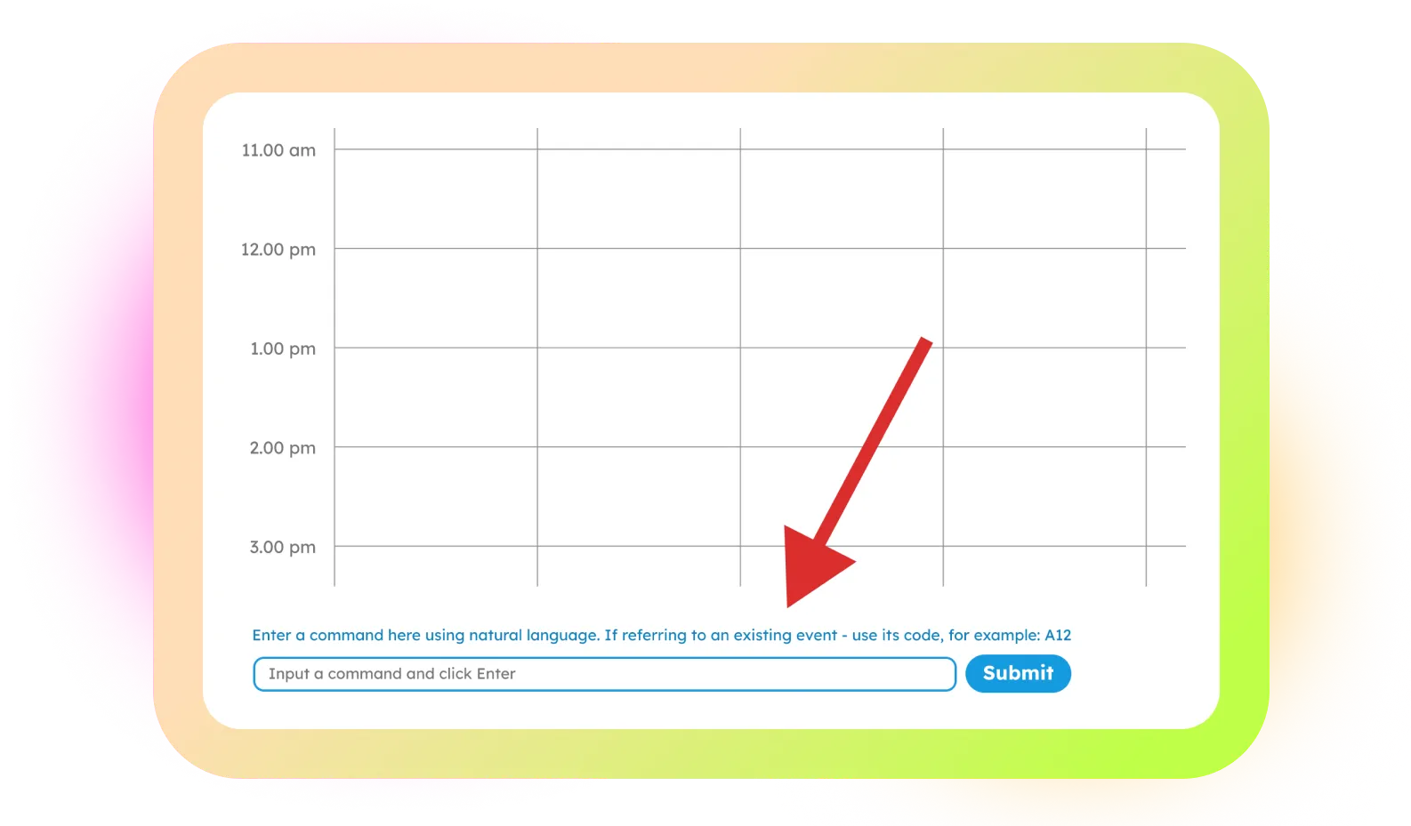
The First Test: Users Didn’t See the Value of NLP
We recruited software developers as our test participants and started the first round of usability testing.
The results surprised us.
Although we had positioned NLP (Natural Language Processing) as one of the product’s key features, users rarely felt the need to use it. When given a task, they naturally looked for buttons, menus, and other familiar interface controls rather than typing what they wanted to do.
One participant summed it up perfectly:
“Why would I type anything if I can do it in 3 clicks?!”
This raised an important question: Were we solving a real user problem, or simply adding NLP because it was a popular technology?
I brought the finding back to the client. However, they believed that incorporating NLP was important because conversational and AI-powered interfaces were becoming a strong trend in product design.
This created a tension between what we thought users would want and what users were actually telling us through their behaviour.
The First Test: Users Didn’t See the Value of NLP
We recruited software developers as our test participants and started the first round of usability testing.
The results surprised us.
Although we had positioned NLP (Natural Language Processing) as one of the product’s key features, users rarely felt the need to use it. When given a task, they naturally looked for buttons, menus, and other familiar interface controls rather than typing what they wanted to do.
One participant summed it up perfectly:
“Why would I type anything if I can do it in 3 clicks?!”
This raised an important question: Were we solving a real user problem, or simply adding NLP because it was a popular technology?
I brought the finding back to the client. However, they believed that incorporating NLP was important because conversational and AI-powered interfaces were becoming a strong trend in product design.
This created a tension between what we thought users would want and what users were actually telling us through their behaviour.
New Solution
Finding the Right Balance
Based on the feedback from our first round of testing and a series of ideation sessions, we decided not to choose between NLP and traditional interactions - we would give users both.
There was a good reason to keep NLP in the product. While most participants preferred clicking, some pointed out that they could see themselves using NLP for more complex tasks where navigating through multiple steps could become cumbersome.
This led to a new design question: How could we make NLP available without forcing users to use it?
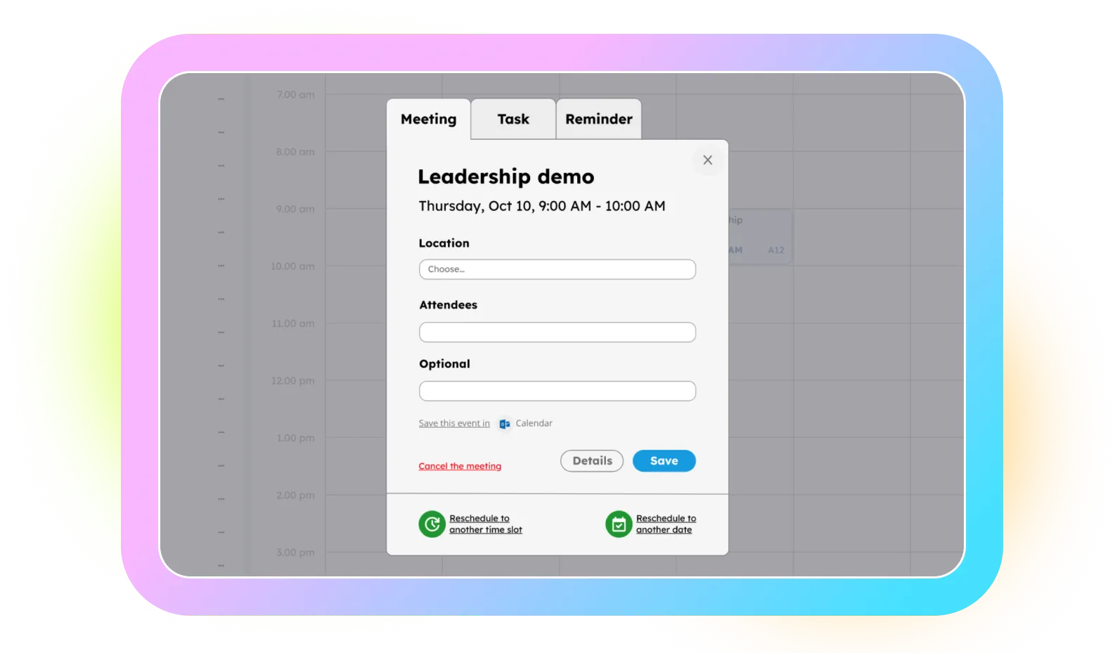
I redesigned the flow around this idea. Instead of making NLP the primary way to interact with the product, I incorporated all NLP actions into a dedicated pop-up window that users could access whenever they needed them.
This approach gave users the best of both worlds: the simplicity and familiarity of clicking for everyday tasks, with NLP available as a more powerful option for complex interactions.
Here is the new prototype: Link to Prototype 3
Finding the Right Balance
Based on the feedback from our first round of testing and a series of ideation sessions, we decided not to choose between NLP and traditional interactions - we would give users both.
There was a good reason to keep NLP in the product. While most participants preferred clicking, some pointed out that they could see themselves using NLP for more complex tasks where navigating through multiple steps could become cumbersome.
This led to a new design question: How could we make NLP available without forcing users to use it?
I redesigned the flow around this idea. Instead of making NLP the primary way to interact with the product, I incorporated all NLP actions into a dedicated pop-up window that users could access whenever they needed them.
This approach gave users the best of both worlds: the simplicity and familiarity of clicking for everyday tasks, with NLP available as a more powerful option for complex interactions.
Here is the new prototype: Link to Prototype 3
Back to Testing
Testing the New Direction
We ran another round of usability testing to see how users responded to the new flow.
The results were very positive: 100% of participants successfully completed the tasks, up from 48% in the first round.
The testing also confirmed what we had expected: users naturally gravitated toward the familiar popup controls, while the NLP feature remained less noticeable. None of the participants chose to use NLP during the tests.
This didn’t mean that NLP wasn’t useful. Rather, it confirmed that users needed a clearer visual cue that it was available as an alternative way to complete their tasks.
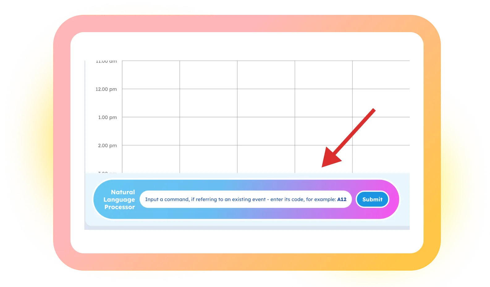
Based on these findings, I suggested making the NLP option more prominent through shape, colour, and typography. The goal was not to push users toward NLP, but simply to make the two interaction options equally visible and let users choose the approach that worked best for them.
Testing the New Direction
We ran another round of usability testing to see how users responded to the new flow.
The results were very positive: 100% of participants successfully completed the tasks, up from 48% in the first round.
The testing also confirmed what we had expected: users naturally gravitated toward the familiar popup controls, while the NLP feature remained less noticeable. None of the participants chose to use NLP during the tests.
This didn’t mean that NLP wasn’t useful. Rather, it confirmed that users needed a clearer visual cue that it was available as an alternative way to complete their tasks.
Based on these findings, I suggested making the NLP option more prominent through shape, colour, and typography. The goal was not to push users toward NLP, but simply to make the two interaction options equally visible and let users choose the approach that worked best for them.
The Outcome

 Email Me
 416.931.7752
 Book a Call